In 2026, bold “circus” stripes are everywhere from powder rooms to entryways. But stripes can easily feel juvenile or chaotic without the right framing. Below are practical ways to use bold stripes so your space reads modern, intentional, and chic.
Save this styling approach for your next refresh.
Where Bold Stripes Actually Work
Not all rooms benefit equally from stripes. The trend shines when you pair scale and purpose thoughtfully:
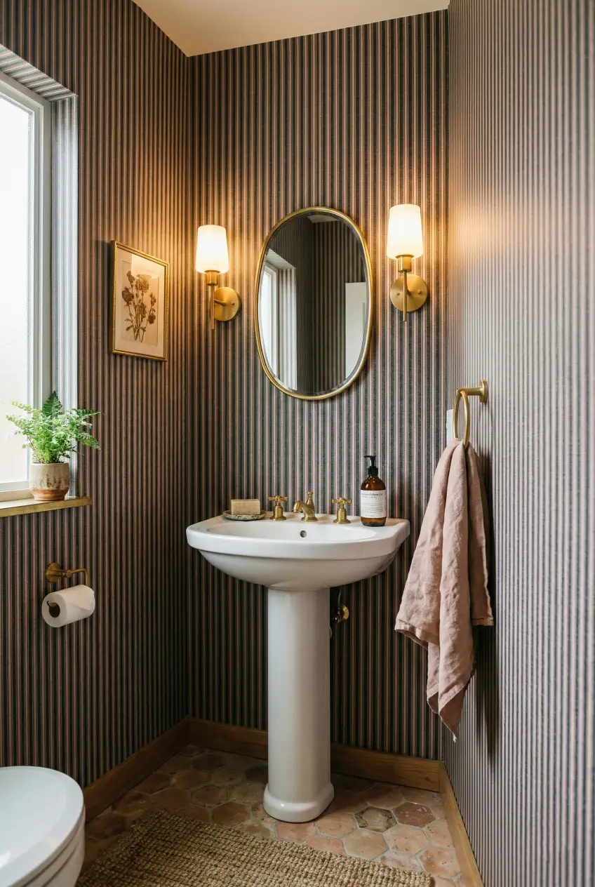
- Powder rooms and small bathrooms. A vertical stripe can elongate walls without overwhelming.
- Accent walls in living rooms or dining spaces, paired with neutral furnishings.
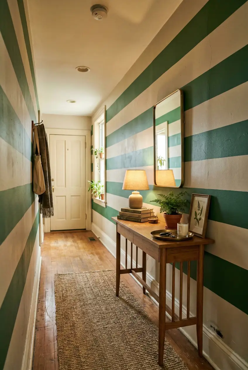
- Hallways or transitional spaces where horizontal stripes can visually widen the passage.
Rules to Keep Stripes Chic and Not Cluttered
Bold patterns demand control. Apply these rules:
- Limit your palette. Stick to two to three colors maximum. Too many hues dilute impact.
- Scale with intention. Large, wide stripes work well on tall walls. Narrow stripes suit low ceilings or small rooms.
- Anchor with solids. Pair stripe walls with solid upholstery, rugs, or cabinetry so the eye has places to rest.
- Balance with texture. Matte paints or grasscloth wallpapers soften high-contrast stripes.

Stripe Placement Mistakes to Avoid
Getting placement wrong turns a trend into visual noise:
- A continuous stripe around an entire room can shrink the perception of space. Instead, limit stripes to one wall or ceiling banding.
- Clashing furniture patterns + bold wallpaper. If you need guidance on how to mix patterns without chaos, see this guide to maximalist decor without chaos.
- Using stripes at eye-level corners creates awkward breaks. Align stripes so transitions happen on flat planes.
Examples That Get It Right
Consider these real-world scenarios instead of generic stock ideas:
- In a small powder room, narrow vertical stripes in muted tones make the space feel taller and intentional.
- A dining room with wide, soft-colored horizontal bands feels expansive when paired with simple wood furniture.
- If you’re aiming for comfort and personality around bold patterns, check how layered, warm spaces work in our lived-in interiors guide.
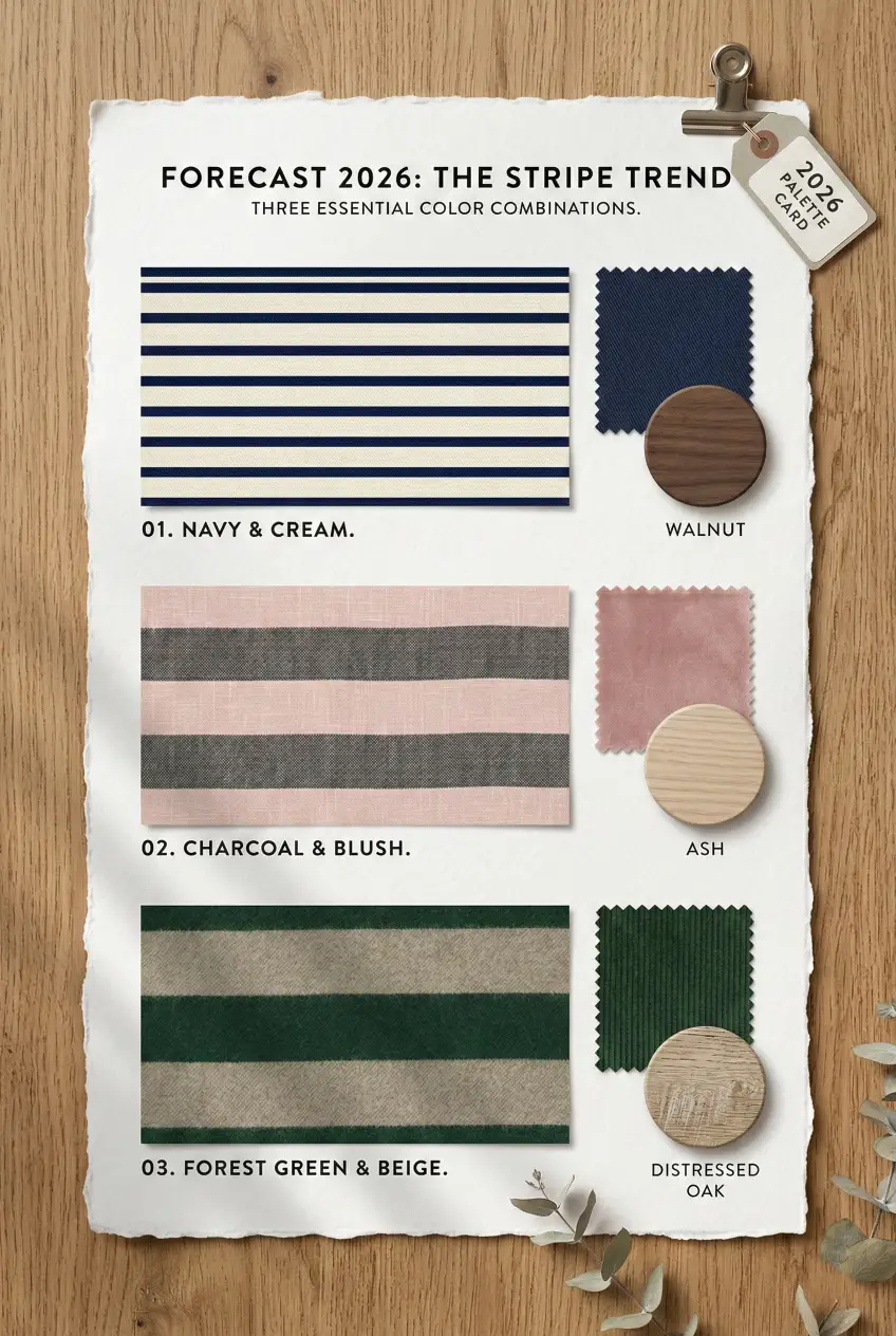
A Simple Starting Palette
Experiment with contrast, but anchor it. For instance:
- Navy + cream. Strong contrast without harshness.
- Charcoal + blush. Modern with a warm edge.
- Forest green + beige. Bold yet grounded in nature tones.
Start with one accent wall and solid elements adjacent. That’s where this trend feels intentional instead of gimmicky.
Save This Trend Guide
This stripe trend isn’t a fleeting gimmick. When executed with restraint and balance, it adds architecture and personality without clashing. Save this guide to reference when planning your next room update.

")
