I love Pinterest. It is where most of us get our decorating ideas. But here is the uncomfortable truth: some trends explode online long after designers quietly moved on. The result? Rooms that look trendy on a screen but oddly dated in real homes because of the outdated home decor trends everyone followed.
I see this all the time when people send me photos of their spaces. The room isn’t bad. It just follows a formula that stopped evolving years ago.
If you are refreshing your home this year, here are the outdated home decor trends designers have stopped using. And more importantly, what actually works instead.
1. All-Gray Everything
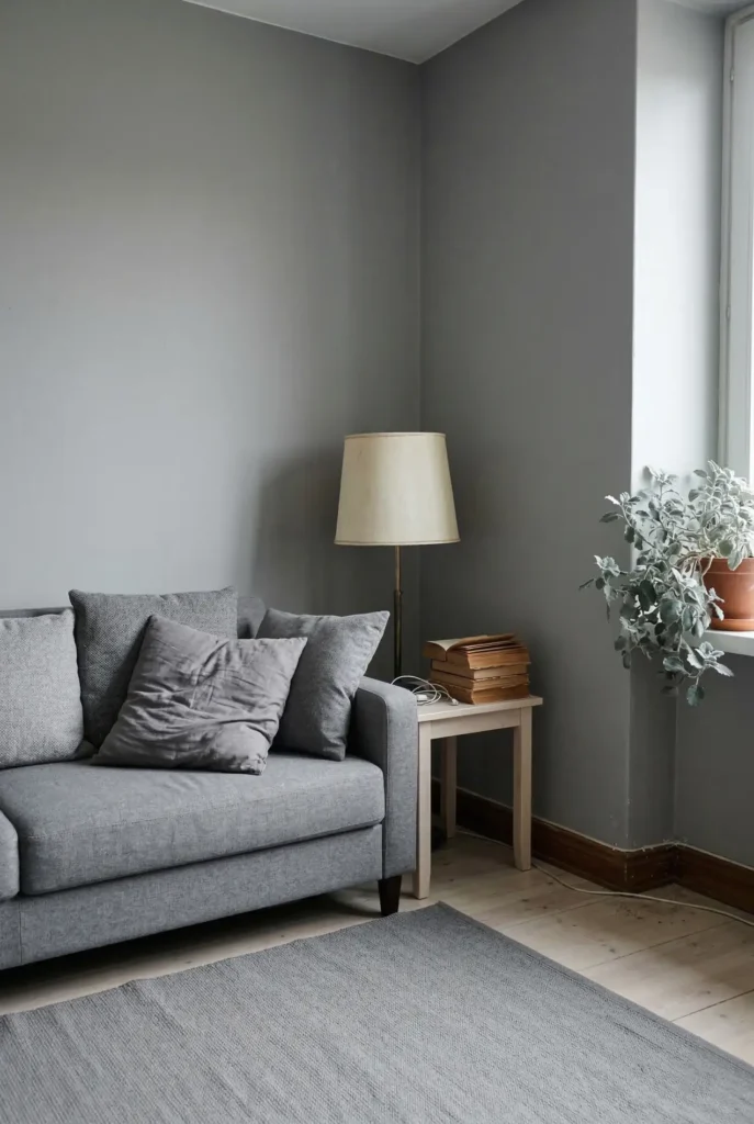
There was a moment when gray interiors were everywhere. Gray walls. Gray sofas, same color for floors and pillows.
It photographed beautifully for mood boards, but in real homes it often feels cold and lifeless.
Why it dates a room:
- No contrast
- No warmth
- No material variation
Everything just blends together into a visual fog.
What works now:
Designers still use gray, but never alone. The updated version mixes gray with warmer materials to bring the room back to life.
- Warm woods
- Linen textures
- Creamy whites
- Earthy greens
The difference is subtle, but the room suddenly feels human again.
2. Tiny Rugs in Big Rooms
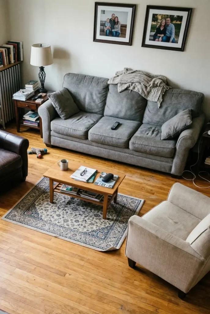
This might be the single most common decorating mistake. A beautiful rug placed like a small island in the middle of a room.
It usually happens because people buy rugs that are too small for the space to save money.
Why it looks outdated: Older styling often showed rugs as small decorative accents. Modern interiors treat rugs as the foundation of the seating area.
The shortcut designers use: At minimum, the front legs of every sofa and chair should sit on the rug.
If the rug can hold the whole seating area, even better. Suddenly the room feels intentional instead of scattered.
3. Word Art Wall Decor
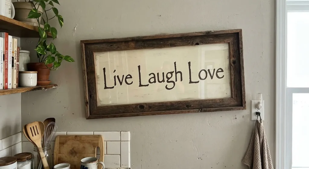
You know the signs. “Live Laugh Love.” “Gather.” “Bless This Home.” These were everywhere online for years, and now they instantly make a space feel dated.
Why designers avoid them: They replace actual personality with decoration that feels mass-produced.
What works better:
- Real original art
- Photography prints
- Vintage paintings
- Simple framed sketches
Swap the words for art, and the room feels personal instead of staged.
4. Open Shelves Packed With Decor
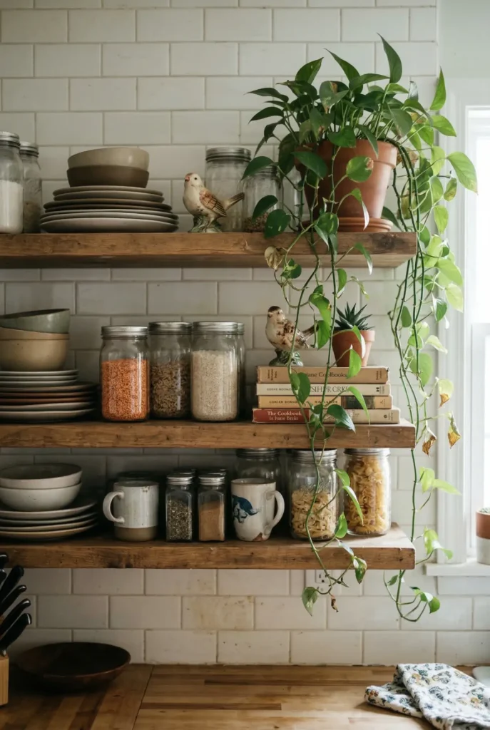
Open shelving had a massive moment. The idea was simple: remove heavy upper cabinets and style beautiful, airy shelves.
The problem is what happened next. People filled those shelves with decorative objects that never moved.
Why it dates a kitchen:
- Too many objects
- No visual breathing room
- Constant daily clutter
The updated version:
Designers still use open shelves, but far more sparingly. Here is the rule to follow:
- 3 to 5 useful items maximum
- Neutral everyday dishware
- One simple plant
- Empty space around objects
The shelf becomes functional storage instead of a dust-catching display.
5. Matching Furniture Sets
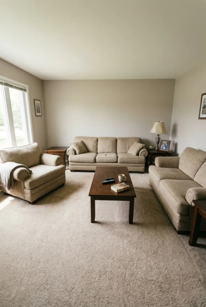
This one surprises a lot of people. Buying a sofa, loveseat, and chair from the exact same showroom set used to be the default.
But perfectly matching furniture now makes rooms feel flat, predictable, and a bit like a catalog.
Why designers avoid it: Real homes feel layered and collected over time. Matching sets remove all of that natural variation.
What works instead:
- One anchor sofa
- A completely different accent chair
- A contrasting coffee table
- Mixed material finishes
The room immediately feels expensive and curated.
6. Fake Farmhouse Overload
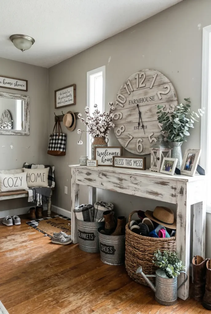
Farmhouse style had an incredible run. But algorithms pushed it so far that many homes ended up looking like themed restaurants. Too many signs. Too many distressed faux-finishes and mason jars.
The problem: When everything is intentionally rustic, nothing feels authentic.
The modern approach: Keep one or two genuine farmhouse elements. A vintage stool or an antique table.
Then, mix them with clean, modern pieces. That high-low contrast is what makes the style work today.
7. LED Color Strip Lighting
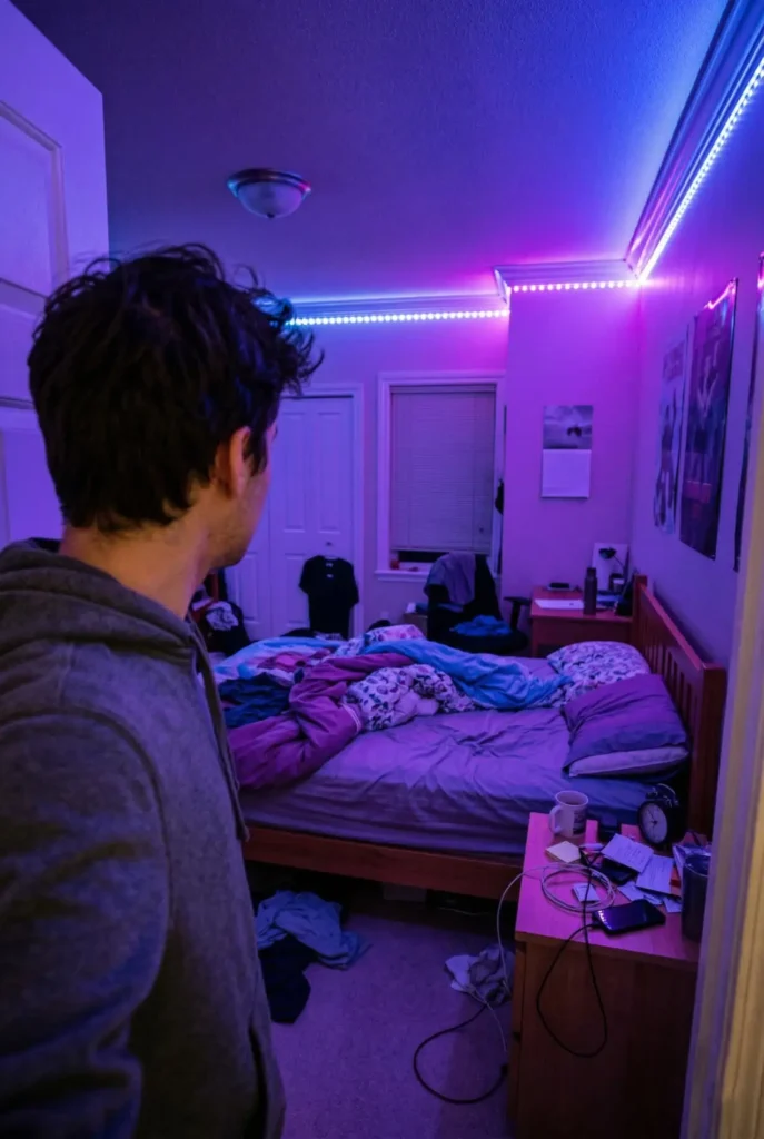
This trend came from gaming setups and quickly migrated into adult bedrooms and living rooms.
Color-changing LED strips glowing purple or blue around the ceiling trim. They look dramatic in a dark photo, but in real homes they often feel harsh and juvenile. Instead of using led stripes everywhere, use the 3 layers of light rule.
Why it ages quickly:Lighting trends evolve fast. Neon color lighting tends to look gimmicky after a few short years.
What designers do now:
- Warm, layered lighting
- Heavy use of table lamps
- Plug-in wall sconces
- Indirect ambient light
Swap the LEDs for warm bulbs, and the room feels calmer instantly.
8. Shiplap on Every Wall
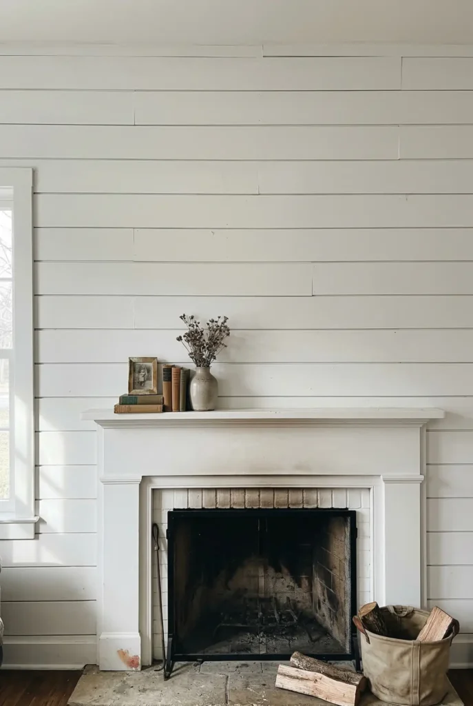
Shiplap became famous thanks to TV renovation shows.
Suddenly, it was everywhere. Accent walls. Fireplace surrounds. Entire living rooms. The problem is heavy repetition.
Why it starts looking dated: When every newly flipped house uses the exact same architectural feature, it stops feeling special.
The better version: Use shiplap only in context, like a mudroom or coastal bathroom.
Otherwise, swap it for more textured, timeless wall treatments. Limewash paint, subtle plaster finishes, or classic vertical paneling age much better over time.
Quick Reality Check Before Copying
Pinterest is still an amazing source of ideas. But the version worth copying is rarely the most viral photo. It is the one that works in real, lived-in homes.
If a trend relies on perfect showroom staging and perfect lighting, it probably won’t translate to your everyday space. The best rooms do not chase trends. They filter them. And that is the shortcut most people miss.


