For a long time, the safe answer was white. Or stainless steel. Or black if you were feeling bold.
Then color started showing up everywhere. First in the Pinterest saves. Then in the stores. Now it’s sitting in your cart and you’re hovering over the buy button wondering if this is a real move or just a vibe you’ll grow out of by next spring.
Here’s what I think. And here’s how to get it right.
Why Colored Kitchen Appliances Are Having a Real Moment Right Now
This didn’t come out of nowhere.
A few things hit at the same time in 2026. The all-beige era peaked and people got tired of it. Kitchens became the room people actually care about styling, not just cleaning. And then brands started making colored appliances that didn’t look like toys.
That last part is the shift that changed everything.
The first wave of colorful countertop appliances was fun but it had a ceiling. The colors were cheerful. Sweet. Hard to build a whole kitchen around without it feeling like a theme.
What’s different now is the palette. Dusty indigo. Deep near-black. Chalky soft green. These aren’t accent colors fighting for attention. They’re tonal enough to anchor a countertop the way a good piece of furniture anchors a room.
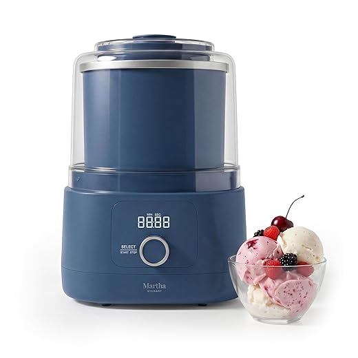
I’ve been watching this shift for a while. The drop that made me stop scrolling this month is Martha Stewart’s first-ever kitchen electrics line on Amazon. And specifically, the color she just added: Indigo.
The Martha Stewart Indigo Drop (And Why It’s the Color I’d Choose)
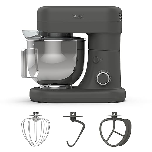
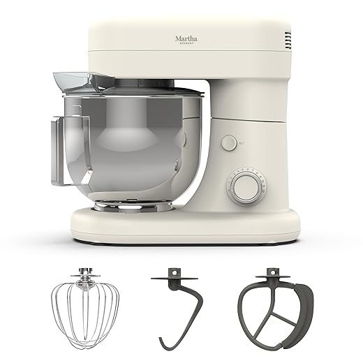
Martha launched her kitchen electrics collection this spring, exclusively on Amazon. Stand mixers, air fryers, electric kettles, toasters, rice cookers, blenders, waffle makers. The full range runs from $39.99 to $299.
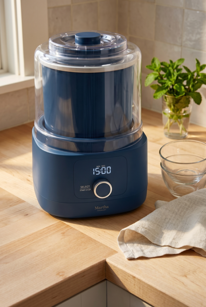
The collection launched in four colors: Honeydew (soft green), Linen (warm beige), Caviar (dark grey), and Sky (light blue). Indigo dropped this month. It’s a deep blue-navy pulled from the palette of her own homes and gardens, and it’s the one I keep going back to.
Not because it’s the boldest. Because it’s the most livable.
Indigo reads almost navy in low light. In natural light it shifts toward something closer to worn denim. It doesn’t fight warm wood countertops or white cabinets. It just sits there looking like a considered decision, which is all you really want from something you look at every single morning.


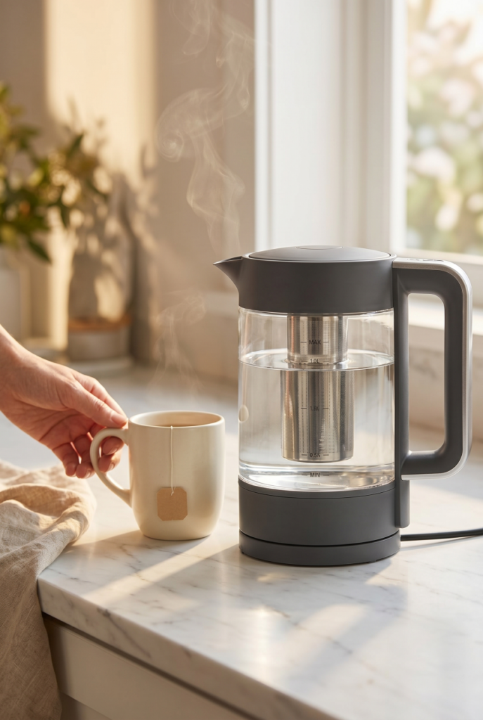
The price point matters here too. The kettle starts at $59.99. That’s a low-commitment way to see how the color lands in your actual space before you go further. I’d start there.
Which Color Is Right for Your Kitchen
Let me be honest about something first. This is not a decision to make from a product photo on your phone. Colors shift depending on your light, your countertop material, your cabinet tone. What looks like a moody navy on screen can read flat grey in a kitchen with one small north-facing window.
That said, here’s how each color in this palette tends to behave in real kitchens.
| Color | Pairs best with | Worth knowing |
|---|---|---|
| Indigo | White cabs, warm wood, greige walls | Reads navy in low light, denim-blue in sun. Hard to go wrong. |
| Caviar | Marble, light stone, any neutral | Functions like a dark neutral. The safest pick if you’re unsure. |
| Honeydew | Raw wood, earthy tile, warm organic tones | Beautiful in the right kitchen. Feels cold in all-white rooms with cool undertones. |
| Sky | White subway tile, brass hardware, light wood | The riskiest long-term. Lighter blues carry a specific mood. Go in knowing that. |
If you’re not sure where to start, go with Caviar. It pulls off that rare trick of reading as a dark neutral rather than a color choice. Against marble it looks expensive. In a moody kitchen it just disappears into the palette. You’ll never look at it six months later and wish you’d gone safer.
Indigo is for people who’ve been drawn to this direction for a while and just needed a good version of it to exist.
How to Style Colored Appliances Without It Looking Like a Theme Kitchen
This is where most people lose the plot.
They buy one indigo toaster, love it, buy an indigo blender, then an indigo kettle, and before long the whole countertop looks like it was decorated by someone with a very focused agenda.
Color cohesion is not the same as color matching.
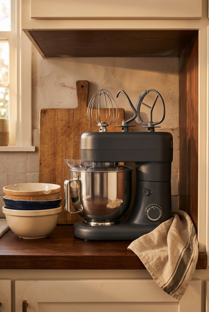
Pick one color. Use it on two appliances. The two you reach for every single day. For most kitchens that’s the kettle and the toaster, or the stand mixer and the blender. Those two create a visual anchor. Everything else stays neutral.
The second thing that makes this work is what lives around the appliances. A linen dish towel. A small cutting board in light wood. A plant that’s actually alive. These things frame the color without competing with it.
This is the part no one talks about: if everything around your appliance is also trying to make a statement, nothing reads. The colored piece needs room to land.
For more on thinking about your countertop as a whole zone rather than individual objects, the kitchen island styling guide covers this territory well.
What Kind of Kitchen Is This Actually For
You already know yours, so I’ll be quick.
White or off-white cabinets with warm wood accents: this is the sweet spot. Any color in this palette lands here. The neutrals around the appliance do the framing work for you.
Dark, moody kitchens with matte black hardware: Indigo or Caviar become part of the palette instead of a contrast. They belong rather than pop. That’s the right effect.
Kitchens with an existing color story: if your backsplash is already zellige sage or your lower cabinets are painted a dusty blue, pull a physical swatch and hold it against your actual surfaces before ordering.
Small kitchens with limited natural light: position the piece near the window or under under-cabinet lighting and the color becomes a feature rather than something that closes the room in.
My Honest Take on the Collection
The design is good. Clean lines, discreet digital displays that disappear when not in use, forms that don’t shout. For the price range, it’s a lot of visual quality per dollar.
The manufacturing partnership with The Cookware Company, which also makes GreenPan, is a reasonable quality signal. These aren’t aspirational objects with fragile guts. They’re made for everyday kitchens where people actually cook.
What I’d start with: the electric kettle in Caviar or Indigo ($59.99). It lives on your counter every day, it’s the piece guests notice first, and at that price the color is a low-stakes test before you go further.
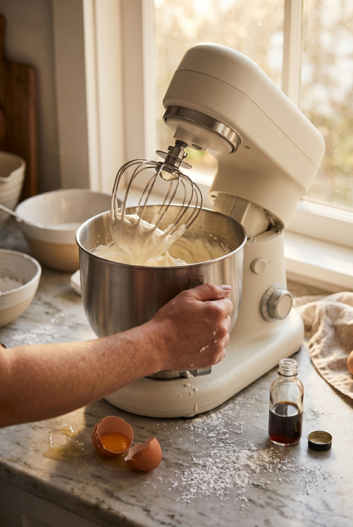
What I’d save for: the stand mixer at $199. More visual weight, more payoff. If the color works for your kitchen, this is the piece that earns it most visibly.
What I’d think twice about: the ice cream maker is stunning in Indigo, but it’s not a daily-use piece. Buy it because you want an ice cream maker. The color being beautiful is a bonus, not the reason.
Colored Kitchen Appliances: Your Questions Answered
Depends on the color. Saturated, high-contrast tones like cherry red or cobalt carry a specific mood that can wear out. Deeper, tonal colors like Indigo, Caviar, and Honeydew sit closer to neutrals on the spectrum. They stop being a “thing” and just become part of the room.
Two pieces in the same color, maximum. The two you use every single day. Let everything else stay neutral. The goal is a visual anchor, not a collection.
For a real home kitchen, yes. The price-to-design ratio is strong and the Cookware Company background is a decent quality signal. At $59.99 for the kettle, the entry point is low enough to try without overcommitting.
This is where they shine most. You can’t change the cabinets or the backsplash. Two pieces in a deep tonal color do more for a rental kitchen’s personality than almost anything else you can buy, and they move with you when you leave.
Search “Martha Stewart kitchen electrics indigo” on Amazon. The Ice Cream Maker in Indigo is live now. More pieces in this colorway are rolling out through May and June 2026. The full appliance buying guide is useful if you’re doing a broader kitchen refresh at the same time
")