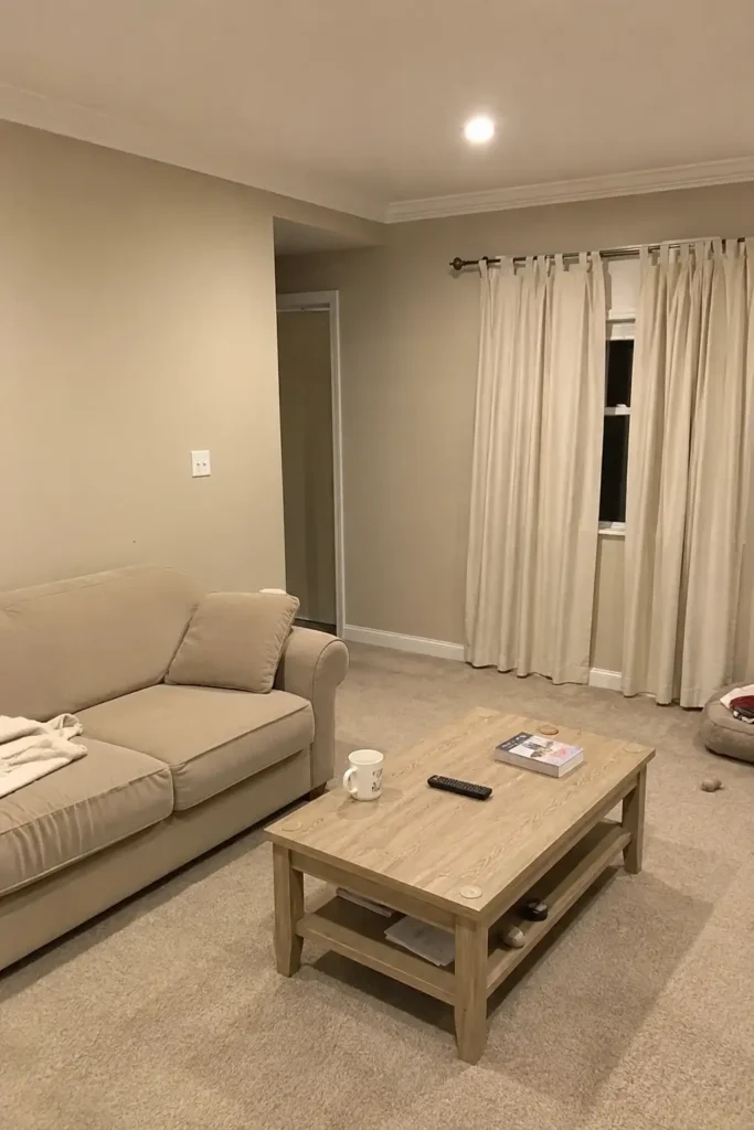
The moment I walked into my living room nook and felt absolutely nothing is when I knew the beige had to go. Not the warm, intentional kind of beige you see in a perfectly styled Scandinavian apartment. The kind of beige that happens when you play it safe with paint colors for years, afraid to commit, so you end up with a room that looks like a rental waiting to happen. Three years of “it’s fine, it goes with everything,” and I had created a space so neutral it was practically invisible.
That’s when I started looking into color drenching, the technique where you paint everything in the same shade and suddenly a forgettable room becomes a space with actual presence. I read the articles, watched the transformations, and decided my sad beige nook was the perfect candidate. Under $50 later, this is exactly what happened.
This guide is for anyone who wants to try color drenching in a small room or nook without hiring a painter. I am not a professional. I spent $48 on paint, used a roller and a brush, and finished over one weekend. If you have a boring beige space and one free weekend, you can do this.
Color drenching is a paint technique where you apply the same color to walls, trim, ceiling, and sometimes furniture, creating one immersive tone in a room. Unlike traditional painting with white trim and ceilings as default, color drenching wraps the whole space in a single shade, blurring boundaries and making the room feel intentional and larger.
What Exactly Is Color Drenching (And How It’s Different from an Accent Wall)
Color drenching means painting every surface in a room (walls, trim, ceiling, and sometimes doors, window frames, and even furniture) in the exact same color. The goal is one seamless, immersive tone, not contrast. It is different from an accent wall (one bold wall only) or a two-tone treatment where the top and bottom halves differ. Before I go into how I did it, let me clear up the confusion I see online.
A quick breakdown of the difference:
| Technique | What you paint | Cost | Difficulty | Best for |
|---|---|---|---|---|
| Color drenching | Walls, trim, ceiling (same color) | $28 to $50 | Moderate (more cutting in) | Small rooms, nooks, powder rooms |
| Accent wall | One wall only | $10 to $20 | Easy (one wall, no cutting in at ceiling) | Living rooms, bedrooms, open spaces |
| Two-tone | Walls split horizontal/vertical | $20 to $40 | Moderate (tape line must be straight) | Kids’ rooms, feature walls, rentals |
If you are deciding between these three, the short answer is: color drenching gives you the most drama for the least money, but it works best in contained spaces. If you have a large open-plan room, an accent wall might actually be the smarter choice. The table below should help you figure out which paint technique fits your room.
Why I Picked This Color (and Why You Should Think About Yours)
I chose a deep olive green. Behr’s Back to Nature, to be exact. Not because it’s trendy (it is), but because I already had warm wood furniture and a cream sofa in the nook, and I needed a color that would make those pieces pop instead of disappearing into beige nothingness. Green does that. It’s a backdrop that feels alive without shouting.
The color you pick for your first color drenching project matters less than committing to the single-shade logic. Some people do dusty pink for a bedroom. Others go for deep navy in a home office. The trick is picking a color that already exists somewhere in your room. A pillow, a rug, a piece of art. That way the space reads as intentional instead of experimental. I had a green velvet pillow that I kept because it was the only color in the room. Now the whole room matches that pillow, and it looks like I planned it all along.
If you are unsure where to start, start with a color you already love in natural light. Paint a swatch. Live with it for three days. Check it at noon, at dusk, and under your lamps. What I learned from my paint color decision-making process is that natural light changes everything. The same green that looked perfect at 2 PM felt almost black at 9 PM. I liked it more at night. It was cozier.
The $48 Color Drenching Experiment: A Paint Technique Anyone Can Try
The part that surprised me most is that this project is cheap. Not “cheap for a room makeover” cheap. Actually cheap. I spent $28 on a gallon of Behr Premium Plus in Back to Nature (flat finish for the walls and ceiling) and $20 on a quart of the same color in satin for the trim. Painter’s tape and a decent brush added nothing because I already owned them. Total: $48.
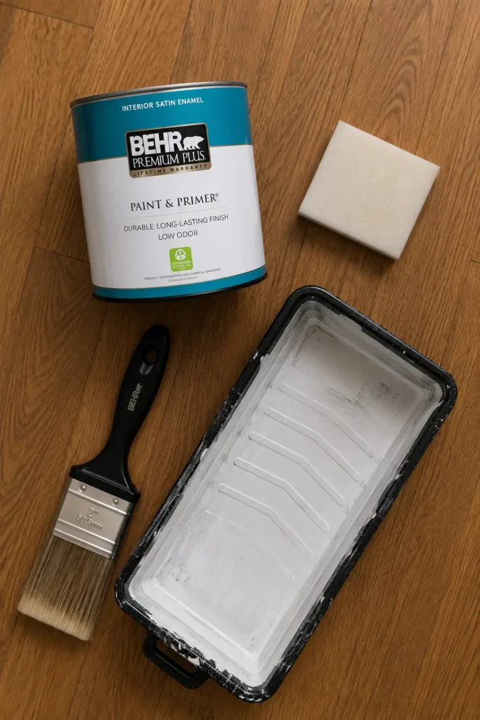
If you are doing a truly small space, like a powder room, a tiny entryway, or a breakfast nook, you can probably get away with one gallon total and paint everything in the same sheen. The key is using flat or matte for the walls and ceiling, and satin or eggshell for the trim if you want durability. Or skip the distinction entirely and use matte everywhere. In color drenching, the whole point is reducing visual breaks. Same sheen means fewer lines for the eye to catch.
-
Step 1: Cleaned everything
-
Step 2: Taped what mattered
-
Step 3: Cut in everywhere
-
Step 4: Rolled the walls and ceiling
-
Step 5: Trim with satin
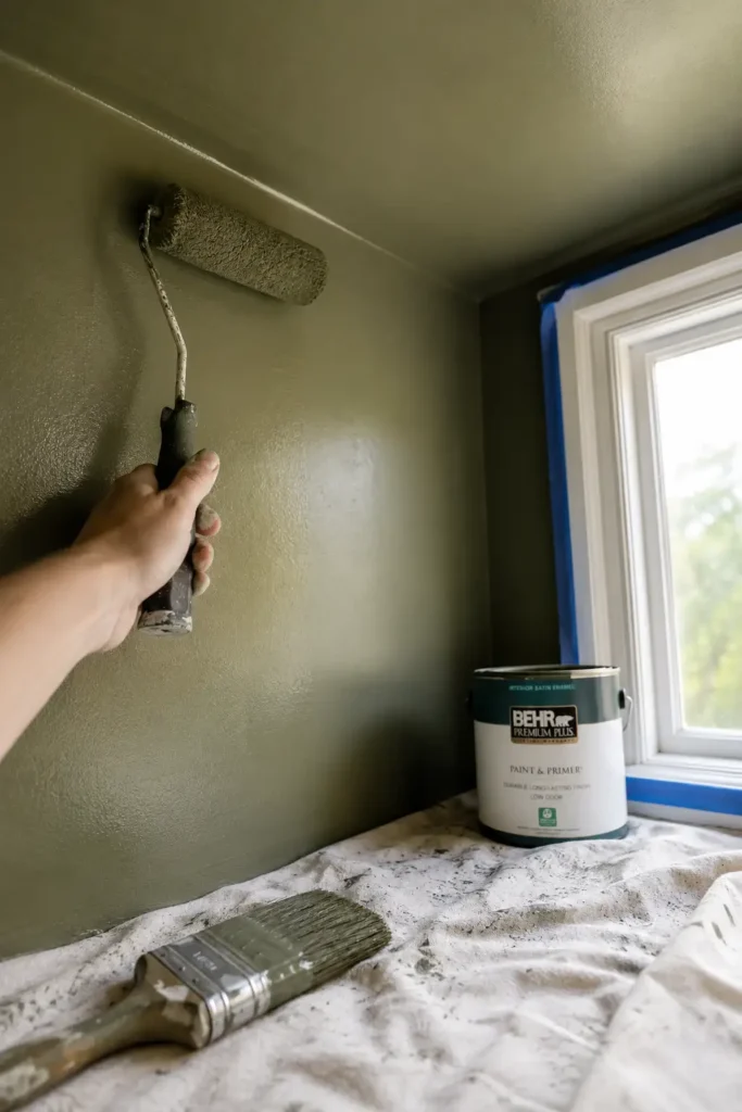
The whole thing took about 12 hours across one weekend. Saturday morning for prep and first coat (roughly 4 hours). Sunday afternoon for the second coat and trim (roughly 3 hours), plus drying time between coats. Paint dries fast in June, which is why summer is the best time to do this. Open windows, fast drying, and no worrying about fumes in a closed room.
One Thing I Would Change
Here is the one thing that went wrong. Instead of taping the top of the baseboards well enough, I let some green paint bleed under onto the white quarter-round. The next morning when the tape came off, I noticed it immediately — a tiny strip of green on white molding that needed touching up by hand with a small brush and the white floor paint I had stored in the basement. That fix took ten extra minutes. Next time, I would either use better tape or skip the tape entirely on the bottom edge and cut in freehand. The bleed was small and fixable, but if I were you, I would spend the extra money on Scotch Blue and press the edges down firmly with a credit card.
What Changed (Beyond the Obvious)
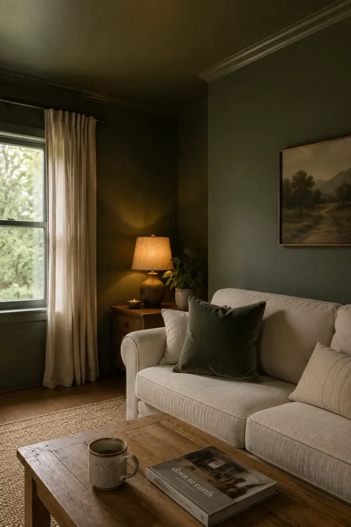
The room went from feeling like a waiting room to feeling like a room someone actually lives in. The change is hard to describe until you see it, but the closest I can get is this: before, my eye never stopped moving around the space. White ceiling. Beige wall. White trim. Beige wall again. Nothing ever landed. After the color drench, my eye rests. The room has one voice. It is calm in a way that beige, ironically, never was.
I also noticed the nook feels bigger. That sounds backward, because painting a small space in dark green should make it feel like a cave. But color drenching tricks your brain. When the ceiling is the same color as the walls, your brain stops measuring where one ends and the other begins. The boundaries blur. That blurred boundary is the whole point of color drenching: you stop noticing the architecture and start noticing the space itself.
If you are still scared of painting a room in a dark color, read my piece on dark paint in small rooms. The five rules apply here too, especially the one about lighting. A color-drenched room needs warm, layered light, not overhead fixtures alone, or it will feel flat. I have a floor lamp in one corner and a table lamp on the sideboard, both with warm bulbs (2700K). That warmth against the green is what keeps the room cozy instead of gloomy.
Where Color Drenching Works Best (Especially with Dark Paint in a Small Room)
Does Dark Paint in a Small Room Actually Work? My Experience Says Yes
This is the question I hear most often. People assume painting a small room in a dark color will make it feel cramped. But color drenching reverses that logic. Because the ceiling is the same shade as the walls, your eye cannot find a hard boundary line. The room feels enclosed, yes. But enclosed in a way that reads as cozy and deliberate, not claustrophobic. My nook is roughly 8 by 10 feet with one window. The deep olive green did not shrink it. It made it feel like a room with purpose.
Not every room needs color drenching. And not every room benefits from it the same way. These are the spaces where it works best:
- Small, awkward rooms: powder rooms, narrow hallways, tiny home offices. The blurring effect makes the space feel less boxy.
- Rooms you use in the evening: a den, a reading nook, a primary bedroom. Darker color drenching creates a cocoon effect that works beautifully at night.
- Spaces with architectural quirks: sloping ceilings, alcoves, wall panelling. Color drenching makes these features feel intentional instead of awkward.
- Open-plan corners: if you have a distinct zone within a larger room (like my nook), color drenching that zone signals “this is a separate space” without building a wall.
Where it is tricky? Large, open living rooms with lots of natural light and multiple zones. In those spaces, one solid wall of windows breaks up the color naturally, and the drenching effect gets diluted. That does not mean it cannot work. The payoff is just smaller for the same amount of effort.
Why This Kills Sad Beige for Good
Beige had its run, I will give it that. And I am not anti-beige the way design Twitter is. I think warm, intentional beige can work when it is paired with strong architecture, good art, and interesting textures. The problem is most of us do not have those things. We have flat beige walls, white builder-grade trim, and a couch we bought on sale. Beige does not elevate that setup. It amplifies the bland.
Color drenching solves the problem from the opposite direction. Instead of adding more stuff to make a neutral room interesting, it changes the foundation itself. One color, one intention, one room that finally feels like yours. The moody aesthetic has been building momentum for a reason. People are tired of safe, and color drenching is the cheapest way to commit.
I wrote earlier this year about why I think beige is due for a rebellion, and color drenching is the quieter, more accessible version of that same shift. FunHaus asks you to redecorate. Color drenching asks you to repaint. One weekend and under fifty dollars, with no new furniture needed.
The Greens I Almost Picked (And Why They Matter)
Before landing on Back to Nature, I tested three other greens: a muted sage that was too gray, a forest green that was too dark for the nook’s single window, and an olive with too much yellow undertone. Testing matters. Paint chips on a counter tell you nothing. Paint swatches on the wall, at different times of day, tell you everything.
If you are color drenching for the first time, test three versions of the same color family. Put them on the wall in big swatches, at least a foot square. Live with them. One will emerge as the right one. The test also reveals something about your room’s light that you probably never noticed before. Like how my nook gets almost no direct light after 2 PM, which made the sage look like beige with a hint of green, basically the same problem I was trying to escape.
Design trends have moved beyond safe neutrals, and if you are still on the fence, my roundup of decor trends that already look dated might push you off it. The all-beige neutral phase is on that list for a reason.
Color drenching is the cheapest, fastest way to transform a room from forgettable to intentional. It does not require new furniture, a contractor, or a big budget. It requires one color, one weekend, and the willingness to commit to something that is not beige.
- Paint the ceiling the same color as the walls in my home office next.
- Try a terracotta or dusty rose in the guest bedroom.
- Add a color-drenched accent wall in the hallway using a dark navy.


