Most people pick the paint color for their TV wall last. They finish the sofa, the rug, the cushions, and then look at that blank wall and think: what now. That order is backwards. Because the color behind your TV doesn’t just affect that wall. It affects how the whole room reads, how large the TV looks, and whether the space feels pulled together or slightly off in a way you can never quite name.
This is not about picking your favorite color. It’s about understanding what the paint is actually doing in that specific spot, behind that specific screen, in your specific light. Get that right and the rest of the TV wall decisions become much easier.
Why the Wall Behind Your TV Is Different From Every Other Wall
Every other wall in your living room is background. The TV wall is a focal point whether you want it to be or not. So the color you put there carries more visual weight than the same color would anywhere else in the room.
There’s also the contrast problem. A large black screen on a light wall creates what designers call high-contrast anxiety. Your eye is pulled to the strongest contrast point in the room, which in most living rooms is the TV against a white or off-white wall. The screen dominates even when it’s off. Even when you’d rather look at something else.
Dark paint behind the TV reduces that contrast. As a result, the screen stops screaming at you when it’s off. It becomes part of the wall instead of a hole in it. That single change, a quart of paint, often does more for how a room feels than a furniture refresh costing ten times as much.
I’m not going to recommend specific paint brands here. The color matters. The brand doesn’t, as long as you’re buying quality interior latex in the right finish. More on finish in a moment.
The Finish Question (Get This Wrong and Nothing Else Matters)
Before the color. Always the finish.
For a TV wall, there is one correct finish: flat or matte. Not eggshell nor satin nor semi-gloss.
Here’s why. Any sheen in the paint will catch and reflect the light from the screen. During a movie, you’ll see a soft glow moving across the wall behind the TV. It’s subtle at first. After a week, it’ll drive you slightly mad. Matte finish absorbs light rather than bouncing it. The wall becomes neutral, calm, and non-distracting in a way that eggshell never quite achieves.
The trade-off is that matte paint marks more easily than eggshell. However, on a TV wall, that’s rarely an issue. You’re not touching it constantly. So the trade-off is worth it in almost every case.
Dark vs. Medium vs. Light: Which Direction Works for Your Room
This is where most guides give you a list of colors without telling you how to think about the decision. So let’s do it properly.
Dark Colors (The First Choice for Most Rooms)
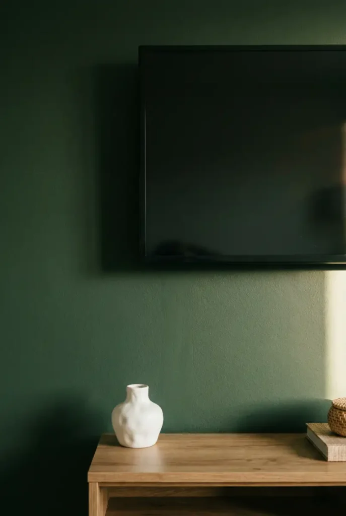
Deep charcoal, warm black, navy, dark forest green, deep terracotta. These are the colors that make the TV disappear when it’s off and create a sense of depth and intention on the wall.
Dark works in rooms with decent natural light. It also works in rooms where you want to create a cozy, contained feeling in the evening. What it doesn’t work in are rooms with very little natural light and no supplemental lighting strategy, because the wall will feel oppressive rather than dramatic.
The mistake most people make with dark is going too cool. A dark blue-grey that looks sophisticated in the store can read as cold and clinical in a room with warm wood tones and cream textiles. Instead, lean toward dark colors with warm undertones: charcoal with a brown base, navy with a green undertone, black with a hint of walnut. Those play better with the warm materials that most living rooms already have.
Medium Colors (The Underused Option)
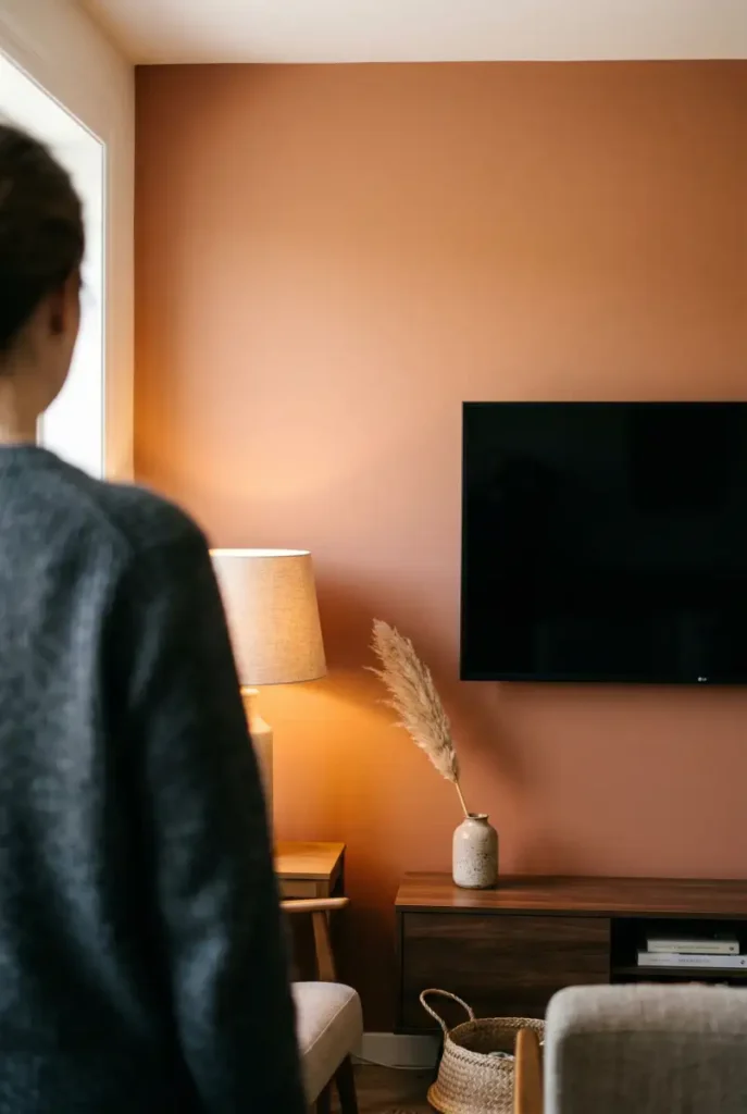
Warm terracotta, dusty sage, clay, ochre, warm taupe. These are medium-depth colors that do something dark colors can’t: they add color personality without committing to the full drama of a dark wall.
Medium colors work particularly well in rooms that get strong natural light for part of the day. In bright morning light, a terracotta wall looks warm and saturated. In the evening with lamps on, it reads deeper and cozier. That range is what makes medium tones so livable.
They’re also more forgiving if your room has mixed undertones in the existing furniture, because a warm medium tone tends to harmonize rather than contrast. If you’re nervous about going dark, a medium warm tone is the version worth trying first.
Light Colors (When They Work and When They Don’t)
Light paint behind a TV can work. But it requires a specific condition: the light color has to have significant warmth or depth to it. A flat warm cream, a pale warm greige, a soft clay white. These can work in rooms where the goal is to keep everything quiet and unified.
What doesn’t work is standard white or cool grey. Both increase the contrast between wall and screen and make the TV look larger and more dominant. Both are the default builder choice, which is exactly why so many living rooms feel like the TV is taking over.
If you want a light TV wall, go warm. Specifically warm. Test the sample in the evening with your actual lamps on, not just in daylight. That’s when you’ll see whether it’s reading as cozy or as clinical.
How Natural Light Direction Changes Everything
This is the part most people skip, and it’s the part that explains why the same color looks completely different in two different homes.
North-facing rooms get cool, indirect light all day. In these rooms, warm undertones in paint are essential. A color that looks balanced in the store will read as cold on a north-facing wall. So go warmer than you think you need to.
South-facing rooms get strong, warm light for most of the day. In these spaces, you have more flexibility. Cooler tones can work because the natural light warms them. Dark colors look dramatic without feeling heavy.
East-facing rooms get warm morning light and cooler afternoon light. Because of that shift, medium tones tend to work best, since they look good across different light temperatures throughout the day.
West-facing rooms get cool morning light and warm golden afternoon and evening light. For TV walls in west-facing rooms, consider that you’ll likely be watching TV in the evening, which is when that golden light is most active. Warm medium and dark tones look exceptional in this light.
The Colors That Consistently Work (And One That Doesn’t)
After seeing a lot of these walls in real homes, there are a few colors that perform reliably across different room types.
Warm charcoal with a brown base is the most consistently effective dark option. It makes the TV disappear when off, looks sophisticated in the evening, and plays well with almost every furniture tone from light oak to dark walnut.
Dusty sage is the most consistently effective medium option. It has enough color personality to feel intentional, but enough grey in it to stay calm. It pairs naturally with wood tones, natural linen, and terracotta accessories without effort.
Warm terracotta is the bolder call that tends to work when people commit to it fully. The rooms where it fails are the ones where someone went half-terracotta, slightly too pink, or too orange. The version that works is the one that leans toward a dried clay or warm brick tone.
The color that consistently underperforms: cool mid-grey. It looks like a safe choice. In practice, it tends to make TV walls look like office breakrooms. It has no warmth, no personality, and it doesn’t reduce the TV contrast effectively. If grey is the direction, go darker and warmer, not lighter and cooler.
Paint only One Wall or the Whole Room?
This is the question people ask most often, and the answer is simpler than it seems.
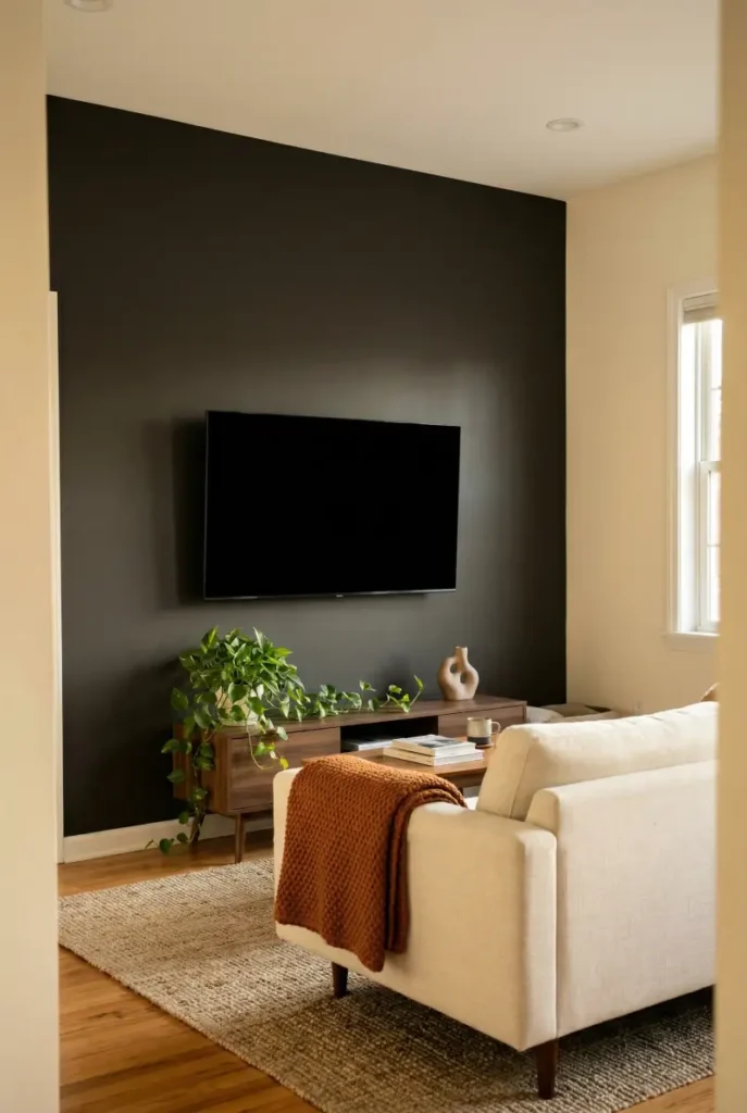
One wall, painted darker than the rest of the room, is almost always the right call. It creates focus, definition, and depth without making the room feel smaller. It also means you’re using less paint, which makes it easier to change if you want to.
Color drenching the whole room, meaning painting all four walls the same deep tone, can work beautifully. However, it’s a bigger commitment and it changes the nature of the room significantly. It works best in rooms with high ceilings, good natural light, and furniture that can hold its own against the color. For most standard living rooms, one wall is enough.
If you’re unsure, start with one wall. See how it changes the room. That alone usually resolves the question.
Once you’ve made the color decision, the next question is what goes above the screen. For that, the guide on what to put above your TV covers every option with specific sizing rules.
And if the floating TV look is still bothering you before you even get to the paint, the breakdown of the most common TV wall mistakes explains why it happens and exactly how to fix it.
One quart covers roughly 100 square feet, which is enough for most single TV walls in one coat. Because you’re going dark, plan for two coats. That means one quart is sufficient for walls up to around 50 square feet in the finished result, so for a standard 8-by-10 foot wall, one quart will do it comfortably.
Only if your lease allows it, which many do for standard interior paint. However, if you’re not sure, there are peel-and-stick wallpaper panels in solid matte tones that mimic the effect of a painted wall and remove cleanly. They’re not as good as paint, but they’re a reasonable alternative that doesn’t require landlord permission.
It doesn’t have to match, but it does have to relate. The easiest way to achieve this is to pull an undertone from an existing element in the room, such as the wood tone of your floor or a color in your rug, and find a paint color that shares that undertone. That connection creates cohesion even when the TV wall is significantly darker than everything else.
Any dark, warm, matte color that reduces the contrast between the screen and the wall. Deep charcoal with a warm base is the most reliable option. The goal is to make the TV’s black frame and screen blend into the wall when it’s off, so the eye isn’t pulled to it as the dominant element in the room.
Both work. A painted rectangle, roughly following the width of the TV console and extending to ceiling height, is the simpler version and looks deliberate without requiring precise cutting. An arch adds a softer, more architectural quality and has been a strong trend in 2025 and 2026. However, the arch requires more careful prep and a steady hand. If you’re painting for the first time, start with the rectangle. The effect is 80 percent as strong with half the complexity.

")
