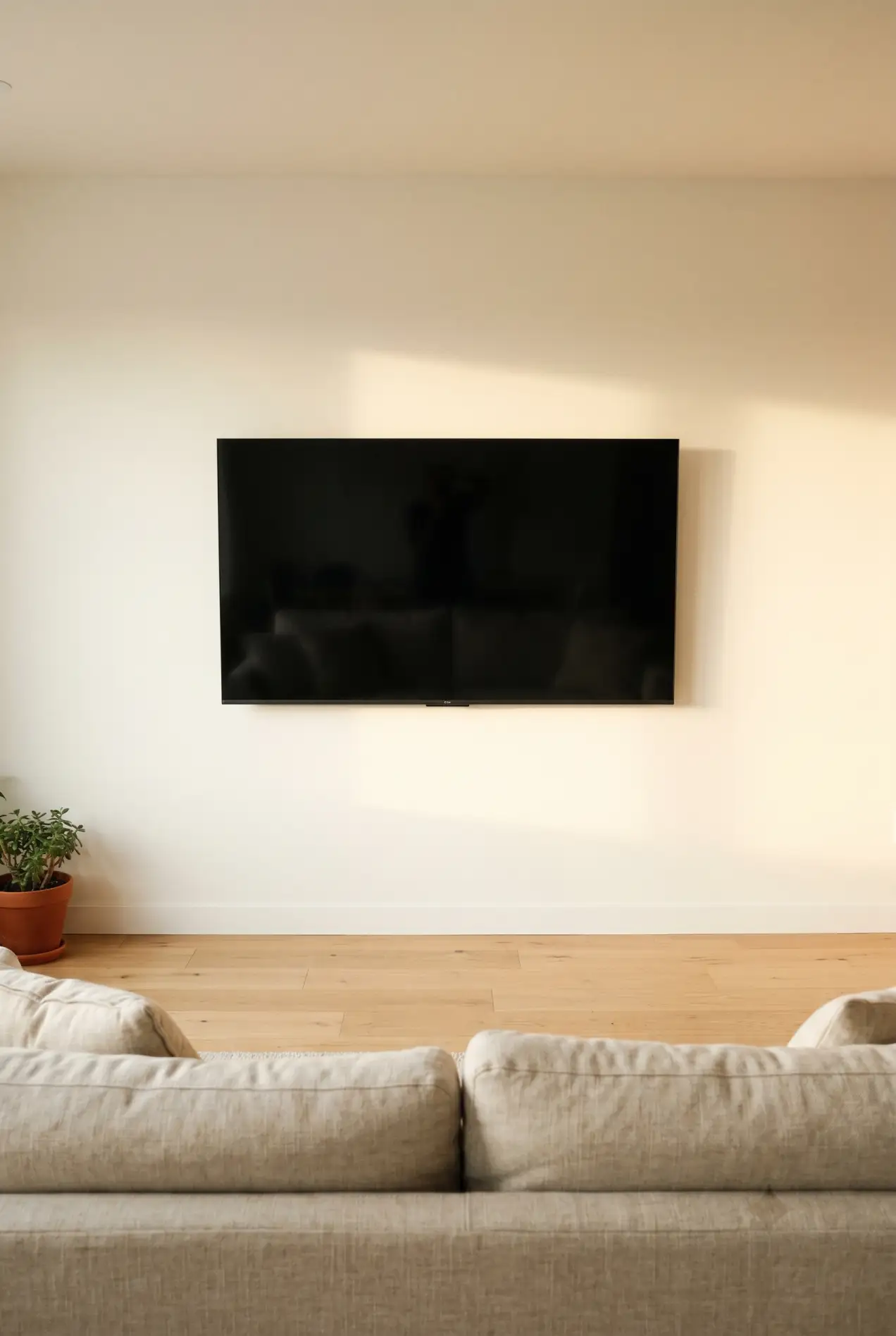
I did my own TV wall last spring. Spent two weeks collecting saved posts, bought a floating shelf, a console, and a set of LED strips. Set it all up. Stood back. It looked like a tech showroom, not a living room.
The problem wasn’t any single piece. It was that I’d added. Minimalist TV walls work by subtraction, not addition. Every element has to earn its place, or the whole wall gets noisy.
Below are five minimalist TV wall design approaches that work in real living rooms, not just in staged photos. Each one has a clear use case, a real cost range, and the specific rules that make it work. Pick the one that matches your room and stop second-guessing.
A minimalist TV wall design keeps the screen as the only focal point on the wall. That means: flush mount with no visible cables, one surface below the TV (shelf or low console), one element beside it at most (plant or single piece of art), and a wall color that closes the contrast gap with the screen. Nothing else belongs on the wall.
What makes a TV wall minimalist
Minimalist doesn’t mean empty. It means nothing on the wall that isn’t doing a job. The TV is doing a job. A shelf that anchors it visually is doing a job. A third floating shelf with decorative objects on it is probably not doing a job. It’s just filling space you felt uncomfortable leaving blank.
Three questions to run against any minimalist TV wall before committing:
- Does the wall have a single clear focal point, or is the eye moving between competing elements?
- Are all cables hidden, or just mostly hidden?
- Does the wall color reduce contrast with the screen, or make it worse?
If you can’t answer yes to all three, the wall isn’t minimalist yet. It’s just less cluttered than before.
Approach 1: flush mount and one shelf (the true minimum)
A flat-screen mounted directly on the wall, one floating shelf below it, cables run in-wall or through a surface kit painted to match. That’s the entire approach. No console, no art, nothing beside the TV.
The shelf exists for one reason: it anchors the TV. A screen mounted with nothing below it looks like it was forgotten there. Even a narrow shelf at 8–10 inches deep gives the TV a base and creates a visual landing point for the eye.
What goes on the shelf: a remote, one small object (a ceramic, a stone, one small plant in a pot). Three things maximum. Anything beyond that tips it into display. The shelf is not a surface for display. It’s a structural element in the design.
Cost: $40–80 for the shelf, $15–30 for a surface cable management kit, $8–15 for paint. Under $150 total. This is the right approach for rentals, for people who want less, and for small living rooms where a console would eat up visual floor space. For small rooms specifically, the small living room TV wall guide covers the proportions that make compact setups work.
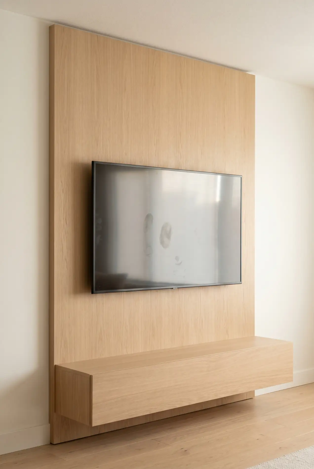
Approach 2: warm wood panel behind the screen
A single panel of light wood (white oak, ash, or a light walnut) covering the wall area directly behind the TV. Not the full wall. Just the section immediately behind the screen, roughly the width of the TV plus 12–18 inches on each side.
In practice, this approach does two things. It closes the contrast gap between the dark screen and the wall, reducing the black hole effect without painting the whole room. And it adds material warmth to what would otherwise be a cold, tech-forward wall.
The rule for keeping this minimalist: nothing on the panel except the TV. No shelves mounted to the panel, no sconces, no art. The panel is the design element. Everything else stays off it — the TV sits flush, and together they read as a single intentional unit.
Cost: $150–400 for materials (real wood veneer panels, not shiplap; flat and smooth is what you’re after). The panel does not need to go floor-to-ceiling. A horizontal panel running from 18 inches above the floor to 12 inches below the ceiling is enough and easier to install. For a deeper look at color behind the TV and how different paint tones interact with screens, the guide on what color to paint behind your TV covers the full range of options.
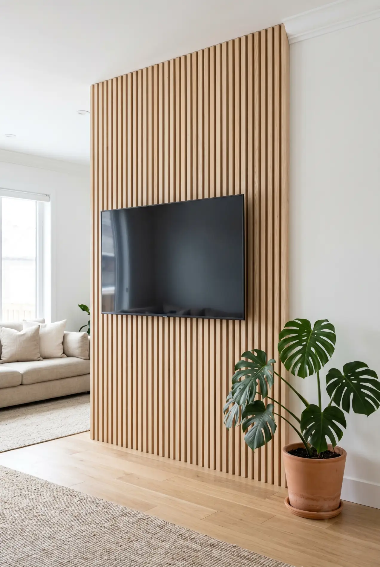
Approach 3: vertical wood slats with flush mount
Thin vertical slats running floor-to-ceiling or panel-height, in a light natural wood, with the TV mounted flush against them. This is the approach that performs best in photographs and in person when the room has decent natural light.
The slats do several things at once: they add texture without color, they make low ceilings feel taller, and they give the TV a backdrop that competes with it just enough that the screen doesn’t read as a black rectangle.
What makes or breaks this approach is spacing. Slats that are too close together look like a fence. Slats that are too far apart look like an incomplete project. The range that works is 1–1.5 inches between slats, with each slat 1–1.5 inches wide. Keep the math consistent. Any variation in spacing reads as an error.
Cost: $200–500 DIY with pre-cut panels or individual slat boards. The pre-cut panel systems (available at most home improvement stores) are easier to keep consistent than cutting individual slats. The full breakdown of slat spacing, tone selection, and installation is in the wood slat wall guide.
Approach 4: Samsung Frame TV (tech-forward minimalism)
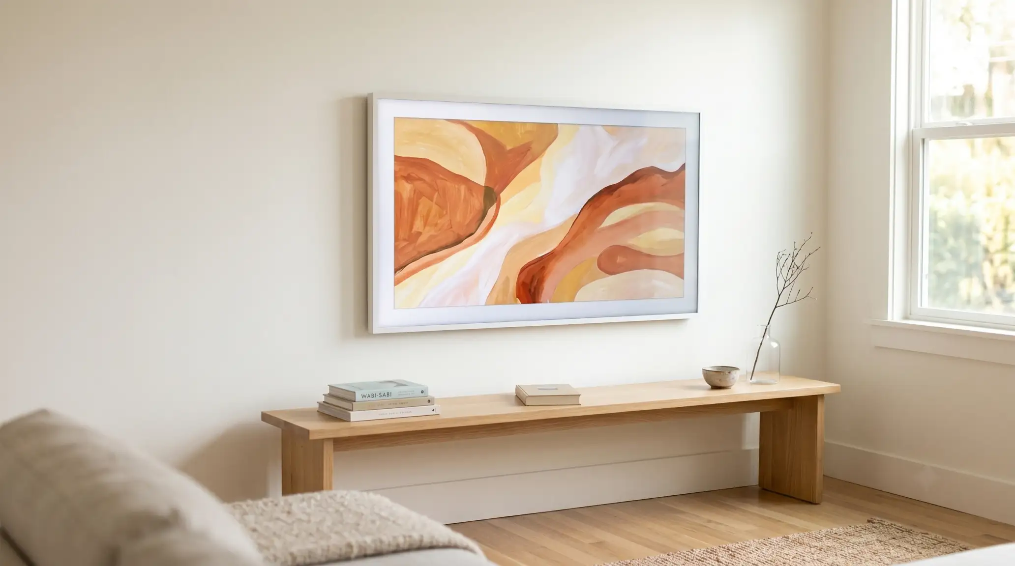
Every minimalist TV wall has one persistent problem: the screen is black and reflective when it’s off. It looks like a void in the wall. No amount of careful styling eliminates this — until you remove the off-state entirely.
The Samsung Frame TV displays art when it’s off. It has a matte anti-reflection finish that doesn’t catch light the way regular TV glass does. The frame profile is 1.1 inches deep, so it sits nearly flush against the wall. On a plain beige or white wall with the right frame color selected, it reads as a framed piece of art from across the room.
Of everything on this list, this approach requires the least work. Mount the Frame TV, hide the One Connect cable (which consolidates all connections into a single thin wire), choose a frame color that matches your wall or trim. The wall around it stays completely bare. Because the screen itself becomes the design element whether it’s on or off, the result is the cleanest possible TV wall.
The Frame TV is not cheap, but for people who find TV walls visually frustrating, it solves the problem in a way no styling approach can.


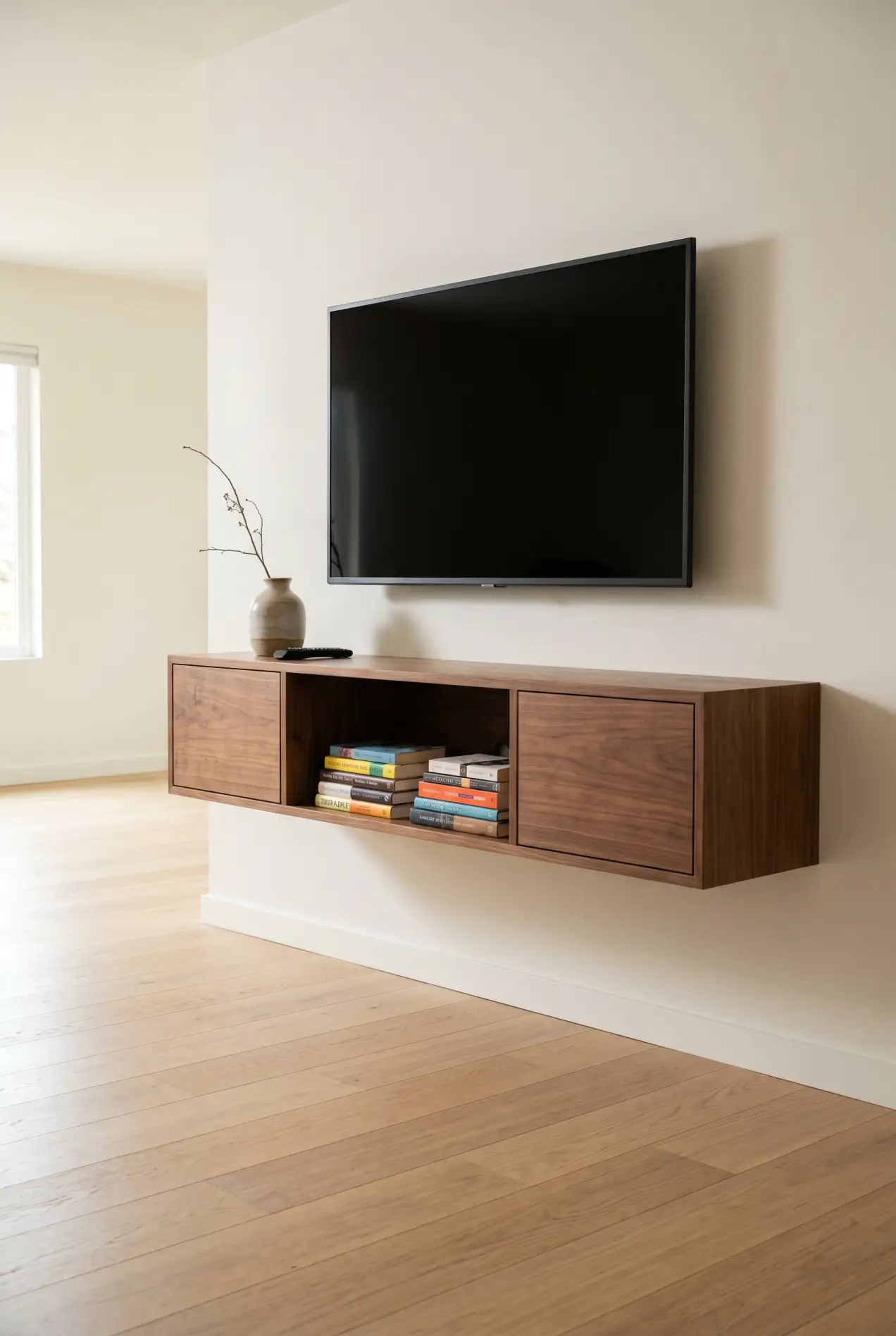
Approach 5: floating TV unit (storage-first minimalism)
For living rooms that need real storage, a wall-mounted floating media unit is the minimalist solution. Not a floor-standing console. A unit that mounts directly to the wall studs, leaving the floor completely clear.
The floor clearance is the detail that makes this approach minimalist. A floating unit at the same height as a regular console reads as lighter and more deliberate, because the floor continues uninterrupted beneath it. The room feels bigger. Visually, the wall reads as designed rather than furnished.
The rules for keeping a floating unit from getting visually heavy: keep it low (18–24 inches off the floor), keep it lighter in tone than the wall, and leave at least one third of the shelf surface empty. Packed storage reads as storage. An edited floating unit, however, reads as design.
Cost: $250–900 depending on width and material. The Walker Edison and Modway ranges hit the $250–400 mark and are available at most major US retailers with free delivery. Both mount to studs with standard hardware.


The three rules every minimalist TV wall must follow
Regardless of which approach you choose, these three rules apply. Violate any one of them and the wall stops reading as minimalist.
1. Zero visible cables
A cluster of cables dangling from a wall-mounted screen is incompatible with minimalist design. Full stop. Either run cables in-wall ($50–150 for the kit, requires drilling), use a surface cable management channel painted to match the wall ($15–30), or use a TV with a single external cable (Frame TV’s One Connect box). The option doesn’t matter. The result does.
2. Wall color that closes the contrast gap
A white wall behind a black screen is the highest possible contrast ratio. The TV wins every time — it’s the first thing the eye lands on and the last thing it leaves. A warm mid-tone wall (soft beige, warm white, muted sage, light warm grey) closes that gap without making a statement. The screen is still the focal point. It just isn’t fighting the wall to be one.
3. One element maximum beside the TV
The single most common mistake in minimalist TV wall design: adding elements one at a time until the wall is full. One plant. Then a piece of art. A small lamp after that. Then a second shelf. Each addition felt reasonable in isolation, but together they accumulate into noise.
If you want something beside the TV, choose one element: a tall plant, a single framed print, or a lamp. Not two of those things. One. The negative space around the TV is doing as much work as the TV itself.
Read this before spending anything:
Which approach fits your room
| Situation | Start here | Budget |
|---|---|---|
| Renting, can’t paint or drill excessively | Approach 1 (flush mount + shelf) | Under $150 |
| White walls, screen looks like a black hole | Approach 2 (wood panel) or Approach 4 (Frame TV) | $150–400 or $900+ |
| Low ceilings, need room to feel taller | Approach 3 (vertical slats) | $200–500 |
| Tech-forward, want the cleanest possible result | Approach 4 (Frame TV) | $900+ |
| Need storage but want the wall to look designed | Approach 5 (floating unit) | $250–900 |
| Small living room | Approach 1 or Approach 3 (vertical lines open space) | Under $500 |


